About hierarchy charts
This feature is available in NVivo Pro and Plus editions. Learn more
Hierarchy charts visualize a hierarchy, helping you to see patterns in your coding or view the attribute values of cases and sources.
There are two types of hierarchy chart in NVivo 11 (Update 1): tree maps and sunbursts.
In this topic
- What is a hierarchy chart?
- What can I show in a hierarchy chart?
- Which type of hierarchy chart should I use?
- How display options affect the chart
- Understanding aggregation in a hierarchy chart
What is a hierarchy chart?
Tree map
A tree map is a diagram that shows hierarchical data as a set of nested rectangles of varying sizes. For example, use size to represent the amount of coding at each node.
Size indicates amount, for example, the number of nodes coded or amount of coding references. The tree map is scaled to best fit the available space so the sizes of the rectangles should be considered in relation to each other, rather than as an absolute number.
Larger areas display at the top left of the chart, smaller rectangles display toward the bottom right.
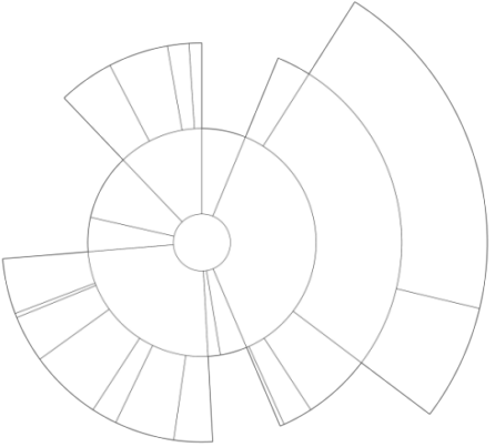
Sunburst
A sunburst is a radial tree map. Hierarchy levels are presented as rings—the innermost ring is the top level of the hierarchy. The rings are divided into segments which represent children in the hierarchy. Use this diagram to see the largest contributing segments (children) in a hierarchy of multiple levels.
When you create a hierarchy chart, it displays in Detail View with two tabs:
-
The Hierarchy Chart tab displays the visual representation of your data.
-
The Summary tab displays the underlying data in a table format.

What can I show in a hierarchy chart?
Sources With a hierarchy chart of sources, you can:
-
Compare the amount of coding of your sources—are some sources more heavily coded than others?
-
Identify sources with most coding references at specific nodes—for example, which sources contain the most coding references to Economy?
Nodes With a hierarchy chart of nodes, you can:
-
Compare the amount of coding at your nodes—do some nodes contain more coding references than others?
-
Visualize prominent themes in your project
-
Identify areas that need further investigation or research
Attribute values If you have classified your sources or classified your cases, you can:
-
Check that you have consulted a variety of sources—for example, have I relied too heavily on journal articles that are more than ten years old?
-
View the demographic spread of your survey respondents
Which type of hierarchy chart should I use?
Hierarchy charts are most useful when you want an overview of data that shows multiple levels of your hierarchy at once.
-
Use a tree map to analyze your hierarchies in one view and compare relative sizes of different aspects of your data. It's easier to compare rectangles than curved segments, so use this chart when you want to compare lots of data and make the most use of your space. It's also easier to read the labels on this chart. Tree maps expand to take up the size of the Detail View.
-
Use the sunburst to see every level of your hierarchy and the contributing segments in each group. Use this chart when you have a deep hierarchy to visualize. It's hard to fit a circular chart into a rectangular window, so the sunburst is best used when space is not an issue. Undock Detail View and enlarge the window to see the full picture of your hierarchy and the different depths of each level. You can draw attention to a single segment or highlight a particular node.
Other visualizations in NVivo can more accurately show coding quantities—consider using a chart if you want to compare quantities for individual items.
How display options affect the chart
Hierarchy charts use size to convey meaning. You can use color to show additional information. This means you can size items in the chart to compare them by one metric, and then color the items to compare them by a second metric—in the same chart.
By default, hierarchy charts are sized by items coded, and colored by hierarchy. Use the Size By and Color By options on the ribbon to change the way data is displayed on the chart. Refer to Change the appearance or content of a hierarchy chart for more information.
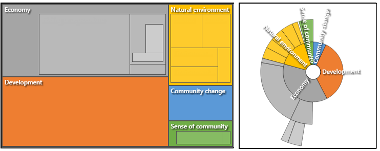
Example - Use default settings
By default, hierarchy charts are colored by Hierarchy and sized by Coding References. This means that each different parent item in the hierarchy is assigned a different color, and the child and grandchild items are lighter shades of the parent color. The items are sized by the number of items coded. This combination makes it really easy to differentiate the branches of your hierarchy.
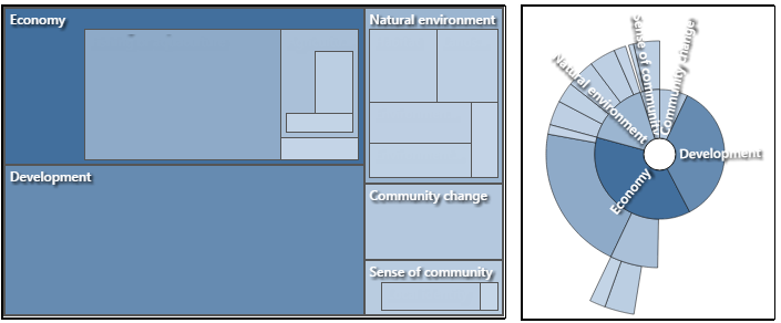
Example - Use color and size to show the same information
This example is both sized and colored by the number of Coding References. Economy has the most coding references so it is the largest area and has the darkest color. Natural environment is smaller and has a lighter color because it has less coding references. This combination uses color and size to emphasize what you're trying to show.
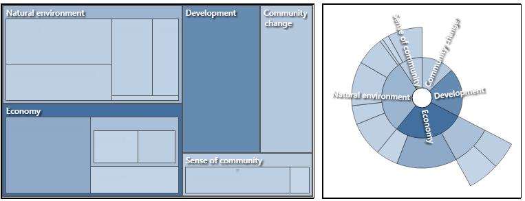
Example - Use color and size to convey different information
This example is colored by Coding References and sized by Items Coded. Natural environment codes the most sources so it is the largest area and Economy has the darkest color because it has the most coding references. This combination results in an information-rich visualization, using the same chart to convey two different aspects of information about your project data.
Understanding aggregation in a hierarchy chart
Hierarchy charts represent your data as aggregated. Even if you have not turned on node aggregation, any node with child nodes will be represented on a hierarchy chart as a parent node including its children.
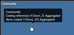
When you hover over an area of the chart, a tooltip displays information for that item and specifies the number of items coded and number of coding references that relate directly to the parent, as well as an aggregated figure of parent plus children.
Hierarchy charts size a node based on whether or not it has children—therefore any node containing child nodes may appear larger than its actual coding. Use the tooltip information to understand the data underlying an area.