

Approaches to analyzing Twitter data
This feature is available in NVivo Pro and Plus editions. Learn more
This topic describes how you might choose to analyze and explore a dataset containing social media data from Twitter.
For information on how to collect and import Twitter data—refer to Import from Twitter.
What do you want to do?
- Explore Twitter data in Detail View
- Gather Twitter data over time
- Exclude biographical information when you import the data
- Visualize Twitter data as a chart
- Display a chart of Tweets over time
- Compare Twitter users by number of followers/following
- Visualize Twitter data with cluster analysis
- Display other items on the cluster analysis diagram
- Visualize your Twitter data as a sociogram
- Working with Twitter sociograms
- Gather Tweets by Username, Hashtag or other predefined columns
Explore Twitter data in Detail View
When you open the dataset in Detail View, you can visually explore it. You can also:
-
Use the sort or filter functions to see patterns in your data. For example, you can filter Tweets to only show those made by a specific user or during a specific date range.
-
Hide columns to limit the amount of data you are looking at—for example, you could hide the Tweet ID and Location columns.
-
Reorder columns—for example, if you want to move the Number of Followers column next to the Username column.
-
Adjust the column width—for example, to expand the column containing the Tweets.
-
Manually code Twitter data at nodes representing themes—refer to Basic Coding in dataset sources for more information.
-
Use automatic coding techniques to perform broad-brush coding of the Tweets—refer to Gather Tweets by Username, Hashtag or other predefined columns.
You can click the tabs in Detail View to get a different perspective of your data.
-
Form View the data one record at a time, laid out as a form.
-
Chart Display a chart of your Twitter data—refer to Visualize Twitter data as a chart for more information.
-
Cluster Analysis Display a diagram that can help you to see patterns in the data—for example, which Twitter users used similar words. For more information, refer to Visualize Twitter data with cluster analysis.
-
Map Geovisualize the data—for example, to see the geographic spread of social media commentators. For more information, refer to Geovisualize your social media data.
-
Twitter Sociogram Displays a sociogram of your Twitter data to see the network of Twitter users and how they are connected by retweets and mentions. Refer to Visualize Twitter data as a sociogram. (NVivo Plus only)
You can also run queries to find and code at themes in your data:
-
Run a Word Frequency query to identify common terms.
-
Run a Text Search query to find all instances of a particular word or phrase.

Gather Twitter data over time
Each time you capture Twitter data, a new NCapture file is created. When you import NCapture files into your project, by default, any matching social media datasets are merged together.
The only time you can merge matching social media datasets is when you import from NCapture. If you choose not to merge matching social media datasets during import, then you will not be able to merge them later in NVivo.
Matching datasets do not need to have the same names. To be considered matching, the social media properties of the datasets need to be the same—for example based on the same hashtag search in Twitter.
Matching datasets captured at different times may include some of the same content. When matching Twitter datasets are merged, any duplicate content is removed.
For example, imagine that you capture Twitter data for the hashtag #climate on Monday and import the NCapture file into your project. Then, on Tuesday and again on Wednesday you also capture Tweets based on the hashtag #climate. When you import these NCapture files into your project, by default, the Tweets from Tuesday and Wednesday are merged together with the dataset from Monday to create a single dataset. You can also view a timeline to see trends over time—refer to Display a chart of Tweets over time.
If you want to merge matching datasets, make sure the Merge matching social media datasets (including previously imported) check box is selected on the Import from NCapture dialog box, otherwise new datasets will be created when you input subsequent NCapture files.
Exclude biographical information when you import the data
By default, when you import data from Twitter, biographical information (location and web address) about the users is imported together with their Tweets.
If you do not want to bring this information into your project—for example, if it is not relevant to your research—you can set your preferences for importing biographical information on the Social Media Datasets tab in the Project Properties dialog box.
For example, you might want to bring in the location whenever you import Twitter data and exclude the other biographical fields.
Refer to Set project properties for more information.
Visualize Twitter data as a chart
Click the Chart tab in Detail View to display a chart of your Twitter data. You can make changes to the chart—for example, you can:
-
Compare the number of references (Tweets) by hashtag or location—refer to Change the appearance or content of a chart.
-
Select a different chart type—for example, a pie chart—refer to Change the appearance or content of a chart.
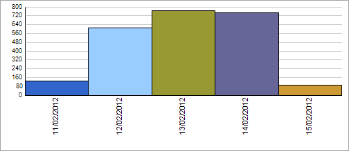
Display a chart of Tweets over time
You can chart Tweets in a timeline to see trends over time—for example, if there is an increase in the number of Tweets on a specific day, you may want to investigate further.
For Twitter datasets containing a User Stream (posts from a specific Twitter user):
-
Click the Chart tab in Detail View. A chart with a timeline on the X-axis is displayed.
For other Twitter datasets (based on a search, favorites, or a list):
-
Click the Chart tab in Detail View.
-
On the Chart tab, in the Options group, click Select Data.

The Chart Options dialog box opens.
-
Under X-axis, choose a timeline option.
-
Click OK.
NOTE Double-click on a data point—for example, bar or column—to see the underlying data. The resulting data will display in Detail View.
For more information on customizing charts, refer to Change the appearance or content of a chart.
Compare Twitter users by number of followers/following
You can view a chart that compares Twitter users by the number of followers and number following.
-
Click the Chart tab in Detail View to display a chart of the dataset.
-
On the Chart tab, in the Options group, click Select Data.
The Chart Options dialog box opens.
-
Under X-axis, ensure that User names is selected.
-
Under Y-axis, select Number of followers/following.
-
Click OK.
Visualize Twitter data with cluster analysis
You can click the Cluster Analysis tab to see a diagram that can help you to see patterns in the data. For example, you can see which Twitter users used similar words.
You can also:
-
Double-click on a data point—for example, a Username—to see the Tweets for that user. The resulting data will display in Detail View.
-
Change the appearance of the cluster analysis diagram—for example to see the data as a 2D or 3D Cluster Map.
-
Display other items on the cluster analysis diagram—for example, to compare similarity by hashtag.
Display other items on the cluster analysis diagram
Cluster analysis enables you to see patterns in your Twitter data—by default, usernames are compared by similarity of words in the Tweets. You can also display other items on the cluster analysis diagram—for example, to answer questions like what other hashtags are similar to #climate?
To display hashtags on the cluster analysis diagram:
-
Click the Cluster Analysis tab in Detail View.
-
On the Cluster Analysis tab, in the Options group, click Select Data.
The Cluster Analysis Options dialog box opens.
-
In the Display items list, select Hashtags.
-
Click OK.
Visualize your Twitter data as a sociogram
This feature is available in NVivo Plus.
The Twitter Sociogram tab displays your dataset as a network diagram, with each vertex representing a Twitter username connected by edges (lines) representing retweets and mentions. Refer to About social network analysis for more information or watch the video.
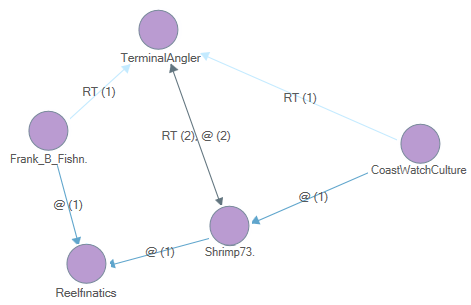
The edges are labelled with notations:
-
Retweets are shown using the letters RT followed by the number of retweets in brackets—for example, RT (3)
-
Mentions are shown using the @ symbol followed by the number of mentions in brackets—for example, @ (6)
Edges can show retweets, mentions, or both—in which case the label would show for example, RT (3), @ (6).
Arrow heads on the edges identify the directionality (the from and to) of the twitter data.
Working with Twitter sociograms
-
Use the Zoom slider on the Status bar to zoom in or out.
-
Click and drag vertices to move them around on the sociogram.
-
Show or hide edges displayed on the sociogram—on the Sociogram Options pane, select or clear the Retweets or Mentions check boxes.
-
Show or hide the edge labels—on the Twitter Sociogram ribbon tab, in the Edges group, select or clear the Show Labels check box.
-
Double-click on an edge or vertex to see the associated Twitter data. The resulting data displays in a separate tab in Detail View. You can also select an edge or vertex first and then on the View Tweets group in the ribbon select Edge or Vertex. An easy way to select an edge is to click and drag your mouse over it—when you release the mouse the edge will be selected.
-
View the centrality measures for the sociogram—on the ribbon, click Centrality Measures.
-
Change the display of the sociogram based on centrality measures—on the Sociogram Options pane, select to resize or recolor the vertices based on a selected centrality measure. Refer to Understand sociogram centrality measures for more information.
-
Copy or export the sociogram as an image, or export the edge list data to a Pajek file.
-
Many of the controls used for Twitter sociograms are similar to those for network sociograms—refer to Work with network sociograms for more information.
NOTE: Larger datasets may take longer to display. You might like to filter your dataset before displaying the Twitter sociogram.
Gather Tweets by Username, Hashtag or other predefined columns
Do you want to gather Tweets from a particular user or hashtag? You can use auto coding to gather Tweets from predefined columns—for example user or hashtag.
The table below is a simplified example of a dataset containing Twitter data.
The columns containing Username and Hashtags are classifying fields and the Tweet column is codable field. Whether the columns are codable or classifying is predetermined and cannot be changed.
| Username | Tweet | Hashtags |
| Person1 | Study: rising sea levels threaten island communities. #climate bit.lyxfgn6B | climate |
| Person2 | Record high temperatures recorded in #arctic due to #ClimateChange. | arctic
ClimateChange |
| Person2 | We need to act now to slow the effects of #ClimateChange. | ClimateChange |
Gather Tweets for each user into a case node
If you auto coded this dataset by Username, you would create the following case node hierarchy:
-
Twitter
-
Username
-
Person1
-
Person2
The case nodes (Person1 and Person 2) are classified as 'Twitter User' and information from the user's profile—for example, Bio and Number of Followers—is stored as attribute values.
Gather Tweets for each hashtag into a theme node
If you auto coded this dataset by Hashtag, you would create the following theme node hierarchy:
-
Twitter
-
Hashtag
-
climate
-
arctic
-
ClimateChange
NOTE You can choose to code based on other predefined columns—for example, Location or Tweet Type (Tweet/Retweet).
NVivo provides a Wizard to guide you through the process of auto coding. Refer to Automatic coding in dataset sources for more information.