

Change the appearance or content of a hierarchy chart
This feature is available in NVivo Pro and Plus editions. Learn more
This topic describes the ways you can customize a tree map or sunburst chart to suit your analytical approach. Hierarchy charts are available in NVivo 11 (Update 1).
What do you want to do?
- Change what the areas are sized by
- Change what the areas are colored by
- Change the colors displayed on a hierarchy chart
- Change the data in a hierarchy chart of nodes or sources
- Change the number of levels displayed on a hierarchy chart
- Change the order of attributes displayed on a hierarchy chart
Change what the areas are sized by
-
On the Hierarchy Chart tab, in the Size By group, click one of the following:
| Option | Action |
| Coding References | Size the areas by the number of coding references. A larger area indicates more coding references. |
| Items Coded | Size the areas by the number of sources coded by the node. A larger area indicates more items coded. |
| Nodes Coding | Size the areas by the number of nodes coding the source. A larger area indicates that more nodes code the source. |

Change what the areas are colored by
- On the Hierarchy Chart tab, in the Color By group, click one of the following options:
| Option | Action |
| Hierarchy | The density of the color represents the level of the hierarchy. The highest level has the darkest shade of the color and each lower level in the hierarchy has a lighter shade of the same color. |
| Coding References | Color the areas by the number of coding references. A darker color indicates more coding references. |
| Items Coded | Color the areas by the number of items coded by the node. A darker color indicates more sources coded. |
| Nodes Coding | Color the areas by the number of nodes coding the source. A darker color indicates more nodes code the source. |
| None | Remove color from the chart. All areas display white. |
| Item Color | Display item colors in the chart.
|
Change the colors displayed on a hierarchy chart
- On the Hierarchy Chart tab, in the Color group, click one of the color options in the gallery.
Change the data in a hierarchy chart of nodes or sources
-
On the Hierarchy Chart tab, in the Options group, click Select Data.

The Hierarchy Chart Options dialog box opens.
-
Use the Compare option to change what is displayed in the rectangles or ring segments.
-
Use the Coded at option to limit the content that is represented.
-
Click OK.
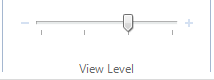
Change the number of levels displayed on a hierarchy chart
If your hierarchy chart displays nested levels of nodes or attribute values, you can choose the number of levels to display on the chart.
-
On the Hierarchy Chart tab, in the View Level group, adjust the slider to display your preferred number of levels.
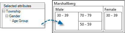
Change the order of attributes displayed on a hierarchy chart
You can change the order of attributes that are displayed on a hierarchy chart that compares attribute value combinations—this can give you a new perspective on the range of sources or cases in your project.
-
On the Hierarchy Chart tab, in the Options group, click Select Data.
The Hierarchy Chart Options dialog box opens.
-
Click an attribute in the Selected attributes list on the right, and then click the Up or Down button. The order of attributes determines the nesting of the areas in the hierarchy chart.
-
Click OK.