

Create a hierarchy chart
This feature is available in NVivo Pro and Plus editions. Learn more
You can generate a hierarchy chart from the Explore tab on the ribbon, or for selected items in List View using the right-click shortcut menu. Hierarchy charts are available in NVivo 11 (Update 1).
What do you want to do?
- Create a hierarchy chart for nodes or sources
- Create a hierarchy chart for attribute values
- Generate a hierarchy chart for selected sources or nodes
- View Word Frequency query results as a tree map
Create a hierarchy chart for nodes or sources
The default hierarchy chart is a tree map. Display your data as a sunburst chart using the Hierarchy Chart tab of the ribbon once a tree map has been generated.
-
On the Explore tab in the Charts group, click the Hierarchy Chart image.
The Hierarchy Chart Wizard opens. Follow the steps on the Wizard.
| Wizard step | Description |
|
Choose what you would like to visualize. |
Select Amount of coding for Nodes or Sources. |
|
Select the items you want to include in the chart. |
|

Create a hierarchy chart for attribute values
A hierarchy chart of attribute value combinations allows you to group cases or sources by attribute value. You need to classify your sources or cases first—for more information, refer to About classifications.
-
On the Explore tab in the Charts group, click the Hierarchy Chart image.
The Hierarchy Chart Wizard opens. Follow the steps on the Wizard.
| Wizard step | Description |
|
Choose what you would like to visualize |
Select Attribute Values assigned to Cases or Sources. |
|
Specify the source or case classification |
Click Select to specify the source or case classification that you want to chart. |
|
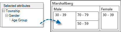
Select the attributes |
In the Show attributes section, select the attributes you want to show on the hierarchy chart. The order of attributes in the Selected attributes box determines the nesting of the areas in the hierarchy chart.
Use the Up and Down buttons to change their order (you can also change this later after the hierarchy chart is generated). |
|
Set the scope |
In the Scope list, select the sources or cases you want to include in the hierarchy chart. |
Generate a hierarchy chart for selected sources or nodes
You can generate hierarchy charts while working with your sources or nodes in List View.
-
Select the sources or nodes in List View that you want to display as a hierarchy chart.
-
On the Explore tab in the Charts group, click the arrow below Hierarchy Chart and then click Hierarchy Chart of Sources, Hierarchy Chart of Nodes. or Hierarchy Chart of Attribute Combinations.
A tree map is generated using the default options.
NOTES
-
You can make changes to the hierarchy chart—including changing the colors or changing the data used to generate the chart—refer to Change the appearance or content of a hierarchy chart for more information.
-
A quick way to create a hierarchy chart for selected items in List View is to right-click and select Visualize then Hierarchy Chart from the shortcut menu.
View Word Frequency query results as a tree map
You can also view Word Frequency query results as a tree map. This type of tree map displays the up to 100 most frequently occurring words in the selected sources or nodes. Refer to Run a Word Frequency query for more details.